
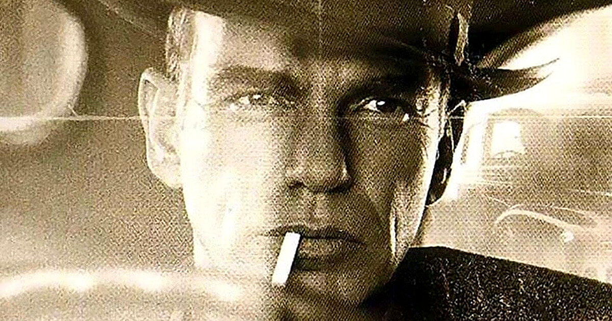
The Man Who Wasn’t There turns 25 this week, and its craft has kept it a fan favourite. The Coen brothers’ black-and-white neo-noir arrived with period detail, a classical score and a look that still feels deliberate. Here is the breakdown of how it came together.
Shot in colour first
The film was made on colour 35mm film and converted to black and white during post-production. Part of the reason was technical: in recent decades the availability of black and white film rolls had become scarce. Because of contractual and marketing requirements, it was released in colour in some countries, but Joel Coen said ‘the film wasn’t made to be seen in colour’ and that in colour it would look ‘horribly out of place’.
Thornton said yes without reading it
The Coens cast Billy Bob Thornton, an actor with whom they had not worked before, for the title role. He accepted before reading the script. ‘I knew that it would be good,’ he said. ‘There are certain people you know you can’t go wrong with.’
Gandolfini needed convincing
The Coens had to convince James Gandolfini, who had just finished filming The Mexican and was about to return to The Sopranos, to join as Big Dave Brewster. He agreed after reading the script and finding Big Dave different from anything else he had done: ‘a big lug, a bit of a loudmouth, and clotheshorse kind of guy.’
O Brother delayed it, then unlocked the finance
The brothers began writing in the mid-1990s, after filming The Big Lebowski, and moved to Ireland to continue. Working Title’s Eric Fellner and Tim Bevan intended to start production in 1999, but the Coens took advantage of George Clooney’s availability and dedicated themselves to O Brother, Where Art Thou? After that film was completed, The Man Who Wasn’t There was financed independently by Working Title, Gramercy Pictures, and Good Machine, raising an approximate budget of $20 million.
Deakins refused to make an old movie
Filming began on June 26, 2000, in California and ended on September 1 after ten weeks. Cinematographer Roger Deakins kept the shots at eye level with normal lenses and a long depth of field. He used a wide range of grays and low contrast rather than strong shadows, with fewer and larger lights, and he wanted the film to reflect the era in which it was made: ‘we’re not trying to make an old movie.’
A Dalí suit and Sinatra’s aura
Production designer Dennis Gassner and costume designer Mary Zophres adapted to the absence of colour by avoiding bright tones and preferring browns and grays. Ed Crane’s clothing used sports jackets, gabardine and rayon shirts. Freddy Riedenschneider’s peaked lapel double-breasted suit was inspired by Salvador Dalí, according to Zophres, to suggest opulence. Thornton looked at images of Raymond Burr and Frank Sinatra, and said: ‘Once you get the right look, everything in your attitude changes.’
Noir with Beethoven, not brass stings
The soundtrack is built on classical music, primarily Beethoven piano sonatas, along with seven new Carter Burwell compositions in his ninth collaboration with the Coens and a Mozart piece. The score’s cyclical structures mirror the protagonist’s situation, while the Coens wanted the music to suggest ‘a vague longing.’ Dan Goldwasser described Burwell’s work as ‘dark and solemn,’ with ‘The Trial of Ed Crane’ carrying ‘a kind of romanticism with just a hint of hope.’ Decca Records released the soundtrack album on October 30, 2001.
Regulars were written in
Doris and Frank were written for Frances McDormand and Michael Badalucco, respectively. Coens regulars Jon Polito and Tony Shalhoub soon joined, followed by Adam Alexi-Malle, Katherine Borowitz, Richard Jenkins and Scarlett Johansson. Jenkins initially declined the casting call because he had been rejected from three previous Coen productions.
Which of these making-of details makes you want to rewatch it first?
Facts from Wikipedia: The Man Who Wasn’t There (2001 film), available under CC BY-SA 4.0.
Film images from TMDB. This product uses the TMDB API but is not endorsed or certified by TMDB.